.svg)

Web Design
May 25, 2025
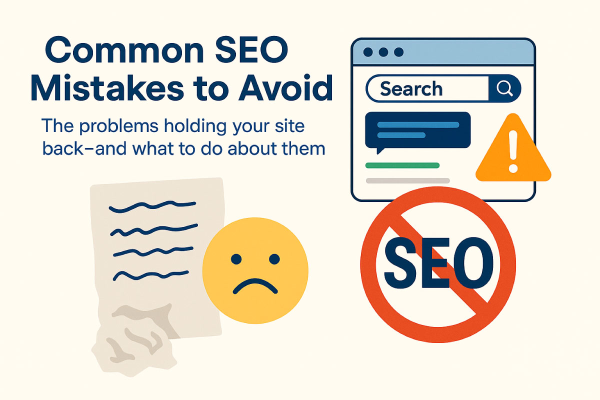
Principles of Effective Website Design
Most small business websites fall into the same trap: they try to look “cool,” but they don’t work. They’re slow, cluttered, hard to navigate, or confusing to read.


Why designing for phones first is no longer optional—and how to do it right
In 2025, more than 60% of web traffic comes from mobile devices. If your site doesn’t load quickly, look clean, and function smoothly on a phone, you’re losing customers—plain and simple.
Google now uses mobile-first indexing, meaning it ranks your site based on its mobile version first—not desktop. So even if your desktop design is stunning, a clunky mobile site will tank your rankings and conversions.
Let’s break down what mobile-first design is, why it matters, and how to implement it on your own site.

Mobile-first design means you start your website layout, UX, and structure by designing for the smallest screen first—then scale up for tablets and desktops.
Instead of building for desktop and cramming it into a mobile layout after the fact, you flip the approach:
Design for mobile → adapt for larger screens.
This method prioritizes speed, simplicity, and usability—especially for users on the go.
If your mobile site is slow, broken, or missing content, your SEO takes a hit.
Mobile users scroll fast, skim content, and want quick access to what matters. If your site is hard to use, they’ll bounce.
More than half of all web traffic now comes from phones. Ignoring that audience = leaving money on the table.
Users search, shop, and even book services directly from their phone. A poor mobile experience can kill your lead funnel.

Use a sticky menu or hamburger menu. Limit top-level items to 4–5. Make buttons big and easy to tap.
Put the most important info—like services, contact, or calls-to-action—at the top.
Use headings, icons, and whitespace to break up content.
Choose fonts that scale cleanly on different screen sizes. Stick to 2 font sizes max on mobile.
Large images = slow loading. Use WebP, compress all assets, and lazy-load videos.
Test your page speed with PageSpeed Insights
Don’t rely on a simulator. Check your site on your phone, a friend’s phone, and different browsers.
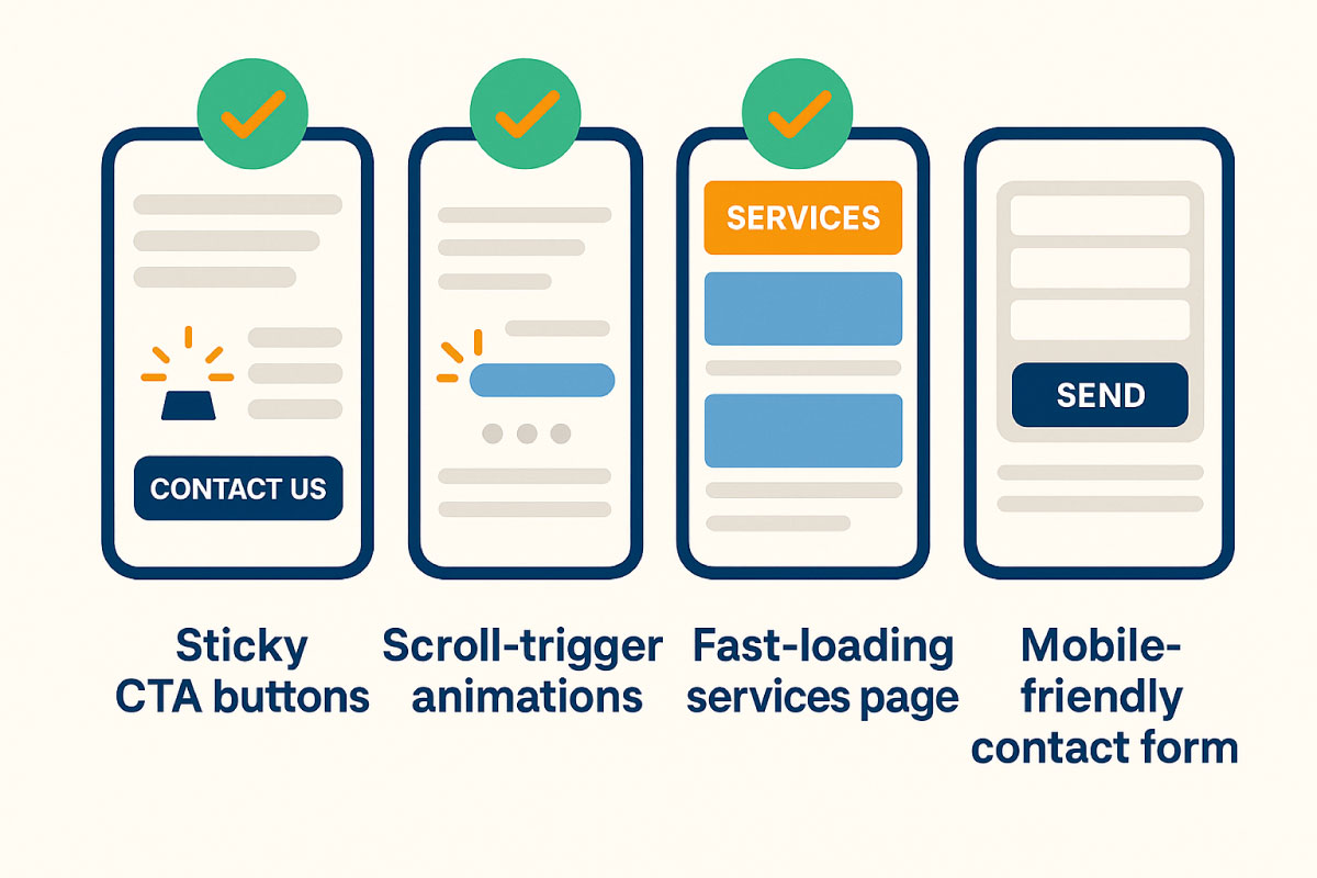
✅ Sticky CTA buttons
✅ Scroll-triggered animations that don’t block content
✅ Fast-loading services page with clear value props
✅ Mobile-friendly contact forms
Want us to review your mobile site? Book a free SEO audit
Your website is your first impression—and more often than not, that impression is happening on a phone.
A mobile-first design doesn’t just make your site look better. It helps you rank higher, load faster, and convert more users into leads and customers.
We help small businesses redesign their websites from the ground up—with performance, clarity, and conversions in mind.
👉 Book a free discovery call and let’s build something people love to use (and Google loves to rank).
Blazon Studio – Look Good. Rank Better.